The Wordle logo doesn’t shout for attention. It doesn’t animate, sparkle, or lean on trendy design tricks. And yet, it’s one of the most recognizable visual marks of the last few years. That alone makes it worth studying.
If you’ve ever opened your browser half-awake, coffee nearby, and seen that familiar “Wordle” header waiting for you, then you already understand why this logo matters. It represents routine, trust, and a strangely comforting daily challenge. This article looks at how the Wordle logo works, why people actively search for things like wordle logo png, and what designers and marketers can learn from its quiet success.
What the Wordle Logo Is (and What It Isn’t)
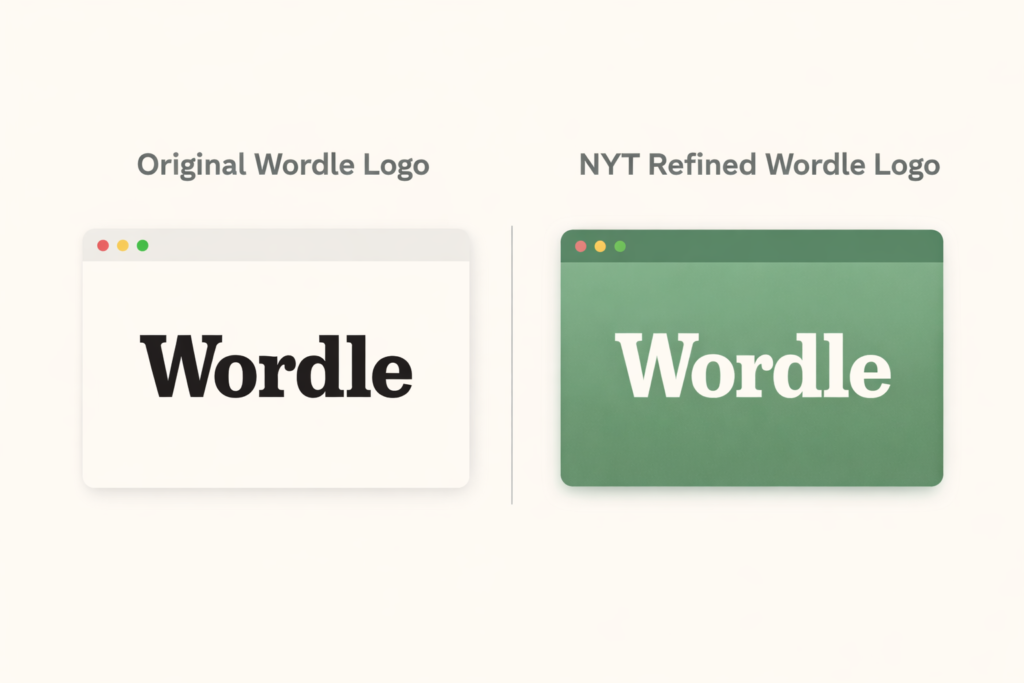
At a glance, the Wordle logo is simply the word “Wordle” set in a bold slab-serif typeface.
- No icon.
- No mascot.
- No symbol sitting beside it.
That choice alone separates it from most modern digital products.
The font used is widely recognized as Karnak Condensed Bold, or a very close variation from the same family. This is important because slab-serif fonts are traditionally associated with print media, credibility, and editorial authority. That connection became even more meaningful after Wordle was acquired by the York Times in January 2022 for a reported low seven-figure sum.
You can see how the logo lives today inside the official Wordle experience on The New York Times Games platform, where it blends naturally with other long-standing puzzle brands without losing its own identity. The fact that the logo didn’t need a redesign post-acquisition says a lot about how strong the original choice already was.
Why People Search “Wordle Logo PNG” So Often
Before diving deeper into design theory, it’s worth addressing a very practical behavior: people constantly search for wordle logo png.
This usually happens for a few reasons:
- Educators adding Wordle examples to classroom slides
- Bloggers and YouTubers explaining game mechanics or trends
- Designers using Wordle as a minimalist branding case study
- Fans creating wallpapers or daily-puzzle templates
Because the logo is text-based and visually clean, it works especially well as a transparent PNG. It scales cleanly, doesn’t lose detail, and doesn’t clash with backgrounds. That technical simplicity is actually part of the branding success, even if most users don’t consciously realize it.
The Visual Identity Around the Logo
While the logo itself is monochrome most of the time, Wordle’s broader visual identity does a lot of the heavy lifting.
The now-famous color system:
- Green for correct letters
- Yellow for misplaced letters
- Gray for incorrect guesses
This grid has become a form of implicit branding. Even without the Wordle logo present, people instantly recognize those colors arranged in squares. It’s one of the rare cases where the result-sharing format became more iconic than the logo itself.
That’s not accidental. The logo stays neutral so the game interface can do the emotional work.
From Side Project to Cultural Habit
Wordle started as a personal project by Josh Wardle, built with no ads, no tracking, and no growth hacks. That origin story matters because the logo reflects that same restraint. It doesn’t feel commercial, and it never really did.
In 2022, Wordle became the top trending search term globally, according to Google Trends data, beating out major news events, celebrities, and tech launches. Millions of users were visiting the same page every day, seeing the same logo, and building a shared ritual around it.
That kind of repetition turns a simple wordmark into an emotional anchor.
Subtle Refinements After the York Times Acquisition
One of the smartest branding decisions the York Times made was not redesigning the Wordle logo.
Instead, changes were subtle:
- Improved spacing and rendering on mobile
- Better alignment with NYT Games navigation
- Cleaner favicon behavior across browsers
- More consistent typography scaling
These refinements helped Wordle feel like part of a trusted editorial ecosystem without alienating its original audience. From a brand perspective, this is almost textbook restraint.
Pros and Cons of the Wordle Logo Design
Pros
- Instantly recognizable through repetition
- Timeless serif typography
- Works across devices and formats
- Builds trust instead of hype
- Doesn’t distract from gameplay
Cons
- Lacks expressiveness on its own
- Depends heavily on context
- May feel “too plain” to trend-focused designers
Still, most of these “cons” are intentional trade-offs. The logo knows its role, and it sticks to it.
What Designers Can Learn From the Wordle Logo
For designers and product builders, the Wordle logo offers a few sharp lessons:
- A logo doesn’t need to explain everything
- Trust is built through consistency, not novelty
- Editorial typography can work in digital products
- Sometimes the interface should be louder than the logo
Wordle proves that minimal branding can outperform flashy design when the product experience is strong enough.
Frequently Asked Questions
The logo itself is minimal, but the Wordle name and branding are protected under trademark law through The New York Times.
Generally yes, in a non-commercial and clearly contextual way. Using it to brand your own product or service is not advised.
Not significantly. Most updates have been technical refinements rather than visual redesigns.
Final Thoughts: A Logo That Respects the Player
The Wordle logo succeeds because it doesn’t try to be clever. It respects the player’s time, attention, and intelligence. In an internet economy built on noise, that restraint feels refreshing.
For brands, designers, and content creators, Wordle is a reminder that sometimes the strongest identity is the one that quietly shows up every day and lets the experience speak for itself.
Read more engaging articles at Hellowordle.